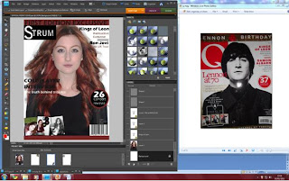
This screenshot shows my image as I cut out the original background and imported it onto another layer.
This image shows my central image and the start of me importing my cover stories and the Q magazine on the left hand side is the magazine which I am basing my front cover on.
This screen shot shows my tile just after it was imported, I chose to put a black box behind the text to make it stand out and to make it similar to the cover I was basing it on.
This image shows my cover after I imported coverlines and the barcode.
This screen shot shows my product after I imported extra images in the bottom left corner.


No comments:
Post a Comment