To complete my preliminary task i used two different programs, 'Photoshop' and 'QuarkXPress'. For me i found producing my front cover easier than the contents page as i am more familiar with the program as I have used it multiple tomes before for various different tasks throughout the media course.
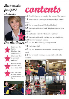
When learning how to use 'QuarkXPress' it made the production of my contents page easier to layout and quicker to make. QuarkXPress can only be used to produce a contents page. When designing my contents page on QuarkXPress I used guidelines to make sure that when i inserted text and images that they were in line and so that it looked more like a professional magazine.
My magazine follows and deviates from the codes and conventions of original magazines as it has:
- mast head
- main image
- issue number and date
- bar code
- bold font
- a number of cover lines
- tag line
- buzz words
This is what my front cover looks like:
For my front cover I didn't follow my sketch as when it came to producing my front cover I had different idea's as to when I made my sketch. Although I didn't follow my sketch I still followed the portfolio booklet with the way it should be set out and the cover lines.
This is what my contents page looks like:
I found this task easy to complete and it was an enjoyable exercise to get us ready to complete our coursework piece. I preferred creating the contents page as I enjoyed using a new software and learning how to create a contents page the way that professional editors would. Overall I found the preliminary task and enjoyable piece of work to complete and the preparation for the task was easy to complete too.


No comments:
Post a Comment