Saturday 30 October 2010
Friday 29 October 2010
Questionnaire Results
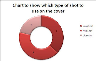
Below there are a series of graphs showing the data which i collected for the different questions which were asked throughout my questionnaire.
The second question which I asked was which colour scheme would they most like to see on the magazine, the most popular answer was red so I chose to have a red colour scheme throughout my magazine.
For this question I asked what magazines they frequently purchase, the most popular magazine which was bought on a regular basis was Look magazine.
In this question I asked how much they would be willing to spend on a magazine, the most popular answer was £5.00, but as I thought that not everyone would buy it for that price, I chose to sell my magazine for £3.00 as it was a more reasonable price.
This question asks
Questionnaire
Questionnaire
1.
Male Female Rather not say
2. Age:
________
3. Who is your favourite band/artist?
_________________________________________________________________________
4. What is your favourite colour?
_________________________________________________________________________
5. What magazines do you frequently buy?
_________________________________________________________________________
6. If you were to buy a magazine, how much would you spend on it?
_________________________________________________________________________
8. What three words would you associate with an indie magazine?
_______________
_______________
_______________
9. What are your likes and dislikes about music magazines?
Likes | Dislikes |
10. If you were to make an indie magazine what would you call it?
_________________________________________________________________________
11.
Long Shot of Artist
Close Up of Artist
Mid-Shot of Artist
12. If you could chose a feature article on a band, who would you chose?
_________________________________________________________________________
Wednesday 20 October 2010
Sunday 17 October 2010
Codes and Conventions of a double Page Spread
All magazine double page spreads must have:
- heading
- font size
- drop cap
- drop quote
- strap line
- byline
- main image
- stand first
- column
A heading is - the title of the text usually spread across the top of the page
The size of the font is normally between 9-12
A drop cap is when the first letter of the text is bigger than the rest of the article text
A drop quote is when a quote from the article is placed in a larger font on the page
A strap line is a short bit of text at the top of the page
The byline is where the name of the interviewer and the photographer is written in small text
The main image links directly to the content of the text
The stand first sums up the article with a darker background and a larger font
Most articles are usually structured in columns
Thursday 14 October 2010
Initial plans
For the initial plans we have to make decisions about:
I chose this price as my magazine will be issued monthly rather than weekly because the issue size will be between 110-125 pages per issue.
The regular content will consist of:
'This weeks top 40'
'Ask us your questions'
'This weeks most downloaded'
'Contact your favourite star'
The feature articles for my magazine:
'An exclusive view of the King Of Leons latest concert'
'Most listened to song of the year!'
'Whats on'
- The price of our magazine
- The frequency of publication e.g. weekly, monthly, every two weeks
- Average issue size
- Regular content
- Feature articles
I chose this price as my magazine will be issued monthly rather than weekly because the issue size will be between 110-125 pages per issue.
The regular content will consist of:
'This weeks top 40'
'Ask us your questions'
'This weeks most downloaded'
'Contact your favourite star'
The feature articles for my magazine:
'An exclusive view of the King Of Leons latest concert'
'Most listened to song of the year!'
'Whats on'
Magazine Research
Title : Q
Cover Price : £3.99
Publisher : Bauer
Genre : Indie/Alternative
Issue Frequency : Monthly
Issue size : 115-132The magazine features: new releases , reissues , music compilations, film and live concert reviews, as well as radio and television reviews. It uses a star rating system from one to five stars; indeed, the rating an album receives in Q is often added to print and television advertising for the album in the UK and Ireland. It also compiles a list of approximately eight albums, which it classes as the best new releases of the last three months.
Title : Mojo
Cover Price : £4.50
Genre : Indie/Rock
Issue Frequency : Monthly
Feature articles-JOHN & YOKO: In a MOJO world exclusive, French journalist Henry Pessar unlocks his treasure trove of never-seen-before photos documenting John Lennon and Yoko Ono’s first days of marriage in 1969.
ANTONY HEGARTY: He spent 10 years as the toast of New York’s underground art scene before hit records and critical acclaim brought his mesmeric music into the public arena.
PEARL JAM: From the grungy streets of Seattle they came, armed to the teeth with a sound that could flatten a building.
Title : NME
Cover Price : £2.20
Genre : Indie/Alternative
Issue Frequency : Weekly
Issue Size : 70
The Inbetweeners take a break from baring their gonads on the telly to do some work experience at NME with typically filthy results. We also speak to the actors behind the characters to find out what it’s like to be riding a wave of critical and popular acclaim (capsule answer: bloody great).
Wednesday 13 October 2010
Evaluation
To complete my preliminary task i used two different programs, 'Photoshop' and 'QuarkXPress'. For me i found producing my front cover easier than the contents page as i am more familiar with the program as I have used it multiple tomes before for various different tasks throughout the media course.
When learning how to use 'QuarkXPress' it made the production of my contents page easier to layout and quicker to make. QuarkXPress can only be used to produce a contents page. When designing my contents page on QuarkXPress I used guidelines to make sure that when i inserted text and images that they were in line and so that it looked more like a professional magazine.
My magazine follows and deviates from the codes and conventions of original magazines as it has:
- mast head
- main image
- issue number and date
- bar code
- bold font
- a number of cover lines
- tag line
- buzz words
This is what my front cover looks like:
For my front cover I didn't follow my sketch as when it came to producing my front cover I had different idea's as to when I made my sketch. Although I didn't follow my sketch I still followed the portfolio booklet with the way it should be set out and the cover lines.
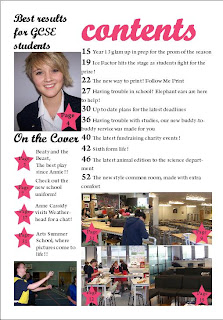
This is what my contents page looks like:
I found this task easy to complete and it was an enjoyable exercise to get us ready to complete our coursework piece. I preferred creating the contents page as I enjoyed using a new software and learning how to create a contents page the way that professional editors would. Overall I found the preliminary task and enjoyable piece of work to complete and the preparation for the task was easy to complete too.
Screen Shots
As we were completing our front coverwewere asked to take screen shots:
This screen shot shows when I imported the main image into photoshop
This screen shot shows my main image and the background
This shows my background image, barcode, price, issue date and cover lines
This image shows when I inserted my mast head
This was my final piece.
Tuesday 12 October 2010
Preliminary Task - Front Page and Contents Draft
For our preliminary task we had to take photographs and edit them to create a front cover and a contents page for a school magazine.
During today's lesson we had to draw a sketch of what we want our front cover and contents page to look like.
Here's the layout which I chose for my task:
The layout for my contents page:
During today's lesson we had to draw a sketch of what we want our front cover and contents page to look like.
Here's the layout which I chose for my task:
- For my front cover I chose to spread the main image across the centre of the page
- My cover stories are spread out across the main image
- The bar-code and price are in the corner of the page
- The title of the magazine is 'PupilPerfect'
The layout for my contents page:
- The main cover story is on the left hand side with a image
- All of the cover stories are along the right hand side of the page with the story headings with the page numbers
- In the bottom right hand corner there are 4 images of feature stories with the correct page numbers to go with the relevant story
- In the middle of the page there is a section where is tells you about stories that are featured on the fronmt cover of the magazine
Subscribe to:
Posts (Atom)


